

Inkswatches are a type of watch that runs on ink instead of batteries.... No, of course inkswatches have nothing to do with the Apple company's stylish wristwatch. Inkswatches are the generic term for ink sample cards of all kinds, that is, the display of the color and properties of inks. And that's where it starts to get complicated: which properties do you want to represent? Shading is best seen when writing, and not so easily when thickly applied. Sheen is easier to see when the ink is applied thickly. But again, the effect is highly dependent on the type of paper.
In this context, I would like to introduce two bloggers who illustrate just these properties very nicely: Mark Lüthke collects his inkwatches on the site Tintanium.de. He has whole books full of ink writing samples and regularly participates in challenges like "30 Days of Blue". He has developed an ink test sheet that is almost a standard for ink testing. And the second site is Mountain of Ink - a blog site by Kelli, who has featured over 1800 different inks there. She also compares very strongly the effect of inks on different papers. And she always compares the inks with other similar inks, so you can compare the representations well.
Then inks are not only used for writing. The scene around urban sketching, uses inks as an alternative to watercolor. Chromathography properties are often used. Nick Stewart is a true master at this, creating perfectly vivid images from a single ink. For this it is necessary to know how the inks dilute, changing their color. Or how they react to bleach. On his site Fountain pen ink art you can find his ink reviews. Due to the close cooperation with Diamine, which has existed for several years, the inks of this company can be found in their entirety. But also many other brands are represented. For example, we have provided him with all the Kobe inks, so there is a nice overview of all 80 colors.

But what is the best way to make inkwatches yourself? For that you should be clear what is most important to you: the color impression compared to other inks, or the typeface or the artistic qualities?
- Paper
To make it easier to compare the inks with each other, use paper that is as white as possible. And always the same one. Preferably one that is also used frequently for writing. Rhodia, for example, produces a very good white paper that is also relatively smooth. So you can see effects like sheen on this paper very well. But also the ink cards from Wearingeul are very good, because they are a bit firmer and you can apply the color more strongly.
For chromatographic experiments you need a watercolor paper. Again, please look for quality but also make sure it is easy to repurchase. Nick Stewart swears by Bockingford paper, but here watercolor paper from Hahnemühle or Exaclair is more recommended. - Writing or blotting
The easiest way to apply the paint is with a cotton swab. This gets a lot of color on the paper, but you can spread it well and sometimes already see if shading occurs. Other options would be to use a cardboard strip as a pen substitute to spread the ink. Or with a glass nib or metal nib: these have the advantage that they are very easy to clean and the amount of ink is not so strong and already more like the ink flow of a fountain pen.
But all of these variants use a large amount of ink that is so rarely put on paper with a fountain pen during normal writing. If Sheen effects are seen here, they do not necessarily occur with the fountain pen as well. Therefore, a complementary writing sample is always ideal. Elli from Mountain of Ink always does this with a whole range of nib weights, but you should just decide what your favorite stroke weight is and use that for a writing sample over and over. That way you can easily see shading effects. What's also much more noticeable with a type sample than with cotton swab ink applications are unpleasant characteristics like bleed-through or fraying.

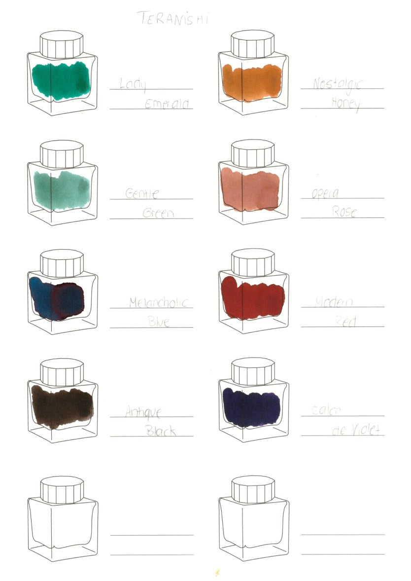
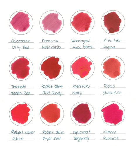
To make it easier for you, we have recently made ink swatches to collect: You can simply select these in our store and have a good overview of the inks of a manufacturer or a color family.To the Ink Swatches

Leave a comment
All comments are moderated before being published.
This site is protected by hCaptcha and the hCaptcha Privacy Policy and Terms of Service apply.